Using Acrylic Paint and Charcoal
This week I had the oppertunity to dabble a bit in the subtractive properties of acrylic paint and make a value scale with charcoal. It has been some time since I have used either medium but here is how they came out: |
| My 1st, 2nd and 3rd Attempt |
The actual process of making the two pieces was a little nostalgic. It brought me back to the art club I was in while in middle school and high school. It has been a long time since I painted something other than a house wall too!
 |
| Final Outcome |

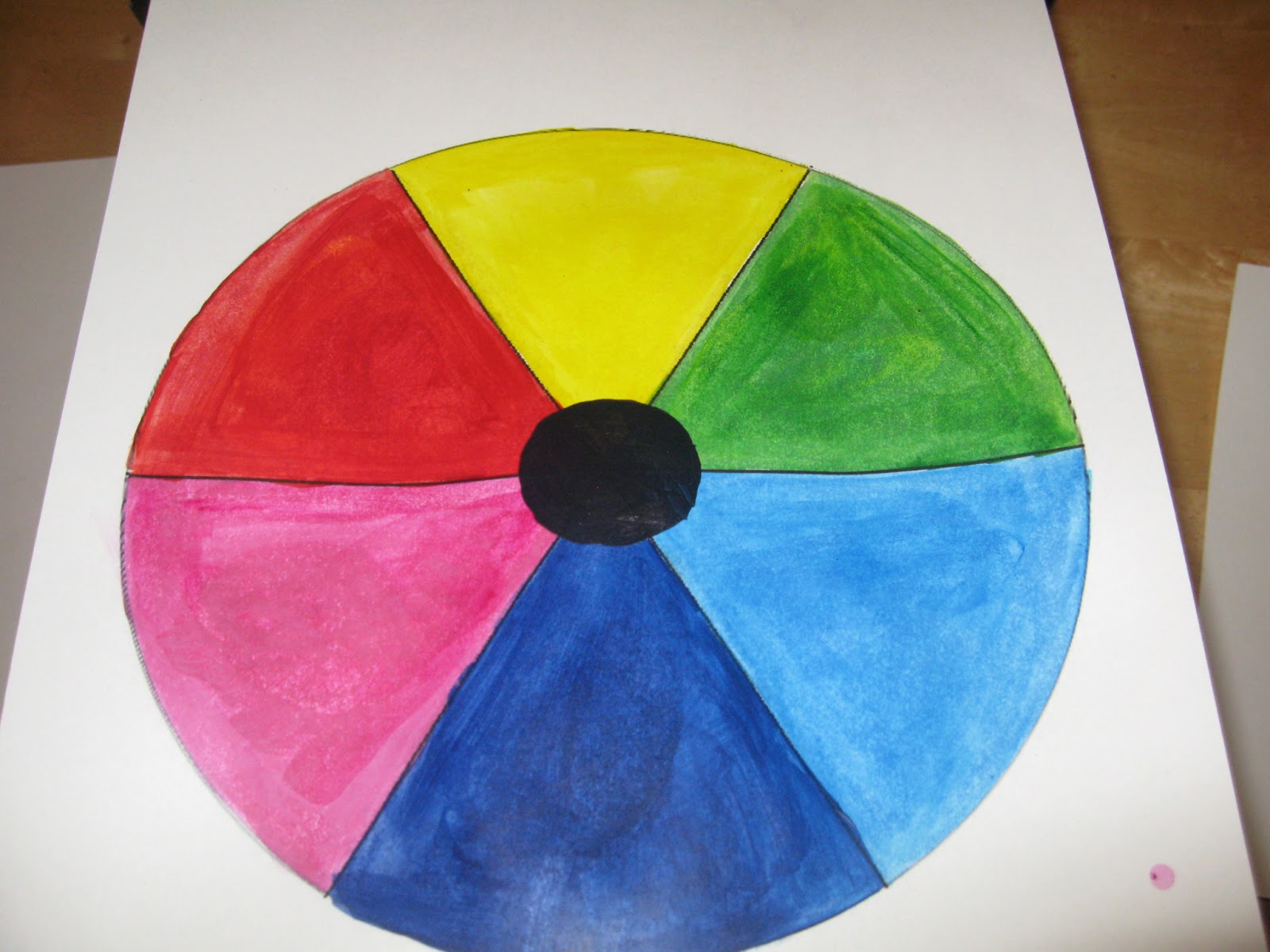
Color Theory 2: Paint/Pigment Primary Colors, The Truth!!!
 |
| 10 Step Value Scale |
This video was crazy to me. Suggesting Red, Yellow and Blue are not the primary colors! WHAT! I had to watch it twice and sure enough the proof was in the pudding as it where. That was the mind blower of it all, that red, yellow and blue are not able to mix a black but magenta, yellow and cyan can! Which makes Red, Blue and Green secondary colors! I felt like I was lied to all through school. Yellow Magenta and Cyan are the 3 colors you see in most printer cartridges so I see the truth behind it but actually having to perform it was a shock. So much for Orange, Purple and Green as secondary colors!
No comments:
Post a Comment