- More Human than Human
- The Greek Awakening: Art from the 5th Century B.C.
- The Measure of all Things: Greek Art and the Human Figure
Wednesday, March 27, 2013
Module Eight - The Human Form in Art
This module was dedicated to the evolution of realism in sculptures and art. Armed with a slew of videos and my textbook we set out to learn how we came from unrealistic portrayals of the human figure to the realistic nature we know so well today. I had the liberty to watch three videos on the topic with a slight range in the coverage, they were as follows:
Friday, March 15, 2013
Module 7 - Architecture
This week the topic of conversation was architecture. How it integrates into our lives and how is has been used to reflect artistic style. The progression of materials used as enabled us to create more and more incredible structures. Some are beautiful to look at, some are massive and awe inspiring and others integrate themselves into the world around them so well you may not be able to tell it purpose. I watched two videos that added on to some information the course textbook offered. I watched the following videos:
Our textbook did a great job of setting a groundwork for the materials that have been used over the centuries. The video started with a focus on the use of steel and the skeleton and skin method of creating buildings. Our text followed a chronological order where steel was prominent in the 19th and 20th centuries. The text and video showed the emphasis on the skeleton and skin technique of building and how the evolving of the building materials enabled us to build the sky scrapers we all know today.
Though the film clearly is dated it has some modern concepts that still are not in use widely today. The whole house automation that ties into the energy usage of the house and integrates into every facet of your life. This did not add much to the information with regards to architecture but did illuminate the concern some people are taking in keeping energy costs down by simply using a computer to track and analysis the usage and plan for optimization. When it came to the more scientific side of Portland cement I did gain some higher knowledge on how this material is created and implemented. The bit on per-stressed concrete was something I have never heard of before.
I chose to watch this video simply because it involved science. I am a fan of both architecture and science so for me it was an easy choice. I do wish it was a little more up to date and showcasing more modern technologies. Though most would be the same or at least similar, computer technology has come a long way in adding to this field.
This ties right in with Green Architecture. The concept is exactly waht this film is about. The main focus on this film is larger living and work areas but the concept holds true in either place. By integrating the building into the environment you desturb less in the eco system of the area and you can harness the natural effects of the earth to heat and cool a building by simply using the earth temperature. This whole video is everything the final section of the chapter covers. The use of natural light to bring light into a building and plan smartly to ensure heat gain and loss at the proper times.
This film was less dated than the first and I really liked how they formatted the video. By showing the reinforcement of the concept throughout the industry and world really shows that this is a concept that is truly being addressed. Simply seeing them build to meet these standards is a true testament to how well the ideas can work and can only get better. Just learning the new ideas that are being put in place to help reduce CO2 admission and renew as apposed to destroy and rebuild really adds to my interest in this topic. It did reenforce the notion that adhering to sustainability does not limit or restrict architecture; yet it forces you to plan and commit to an idea that fits the environment of your site as well as the intended use. We may be past the intricate religious carving on a mass scale, but we are now moving towards practicality and beautification at the same time. Sustainability just asks that you take all materials and energy usage into consideration when planning.
Again I chose this video simply on the basis that it was a topic I knew I would enjoy. The things they are doing with architecture now are amazing. The use of roof top gardens and greenhouse effects are truly works of art. These technical considerations mixed with integration of usable space helps not only the earth but the people using the structures. I have seen many shows and videos on people using the natural temperature of the earth to heat and cool their homes while using the sun and wind to harness the power need to run their house. Build an entire business complex to meet the same demands is astounding. Reusing water from rainfall or local sources to control humidity and temperature is a practical intent for the future. I am not sure cost is ideal in all of these situations but I am sure that this is why more people and companies do not make use of it yet, I stress YET.
- Architecture: The Science of Design
- Last Call for Planet Earth: Sustainable Development and Architecture
Architecture: The Science of Design
This short video focused on the ever evolving technology that goes into the creation of new architecture. From the materials to the advancements in science that allow us to manipulate the materials of old into stronger more versatile products.Our textbook did a great job of setting a groundwork for the materials that have been used over the centuries. The video started with a focus on the use of steel and the skeleton and skin method of creating buildings. Our text followed a chronological order where steel was prominent in the 19th and 20th centuries. The text and video showed the emphasis on the skeleton and skin technique of building and how the evolving of the building materials enabled us to build the sky scrapers we all know today.
Though the film clearly is dated it has some modern concepts that still are not in use widely today. The whole house automation that ties into the energy usage of the house and integrates into every facet of your life. This did not add much to the information with regards to architecture but did illuminate the concern some people are taking in keeping energy costs down by simply using a computer to track and analysis the usage and plan for optimization. When it came to the more scientific side of Portland cement I did gain some higher knowledge on how this material is created and implemented. The bit on per-stressed concrete was something I have never heard of before.
I chose to watch this video simply because it involved science. I am a fan of both architecture and science so for me it was an easy choice. I do wish it was a little more up to date and showcasing more modern technologies. Though most would be the same or at least similar, computer technology has come a long way in adding to this field.
| Steel used with old techniques and modern flare |
Last Call for Planet Earth: Sustainable Development and Architecture
This video was quite a bit longer than the first but covers a wide variety of view points from architects around the world. I think that was the best part of the video, to include the viewpoints of this sustainable topic and how they were so similar despite the origin. The major focus of this video was reducing the carbon footprint of a structure and building with the future in mind. Keeping the earths raw materials in tact and using more renewable materials along with better planning for heating and cooling will reduce cost and help sustain the environment. The idea is to build to accommodate the people while using the natural environment to our advantage without destroying or wasting resources that are not renewable.This ties right in with Green Architecture. The concept is exactly waht this film is about. The main focus on this film is larger living and work areas but the concept holds true in either place. By integrating the building into the environment you desturb less in the eco system of the area and you can harness the natural effects of the earth to heat and cool a building by simply using the earth temperature. This whole video is everything the final section of the chapter covers. The use of natural light to bring light into a building and plan smartly to ensure heat gain and loss at the proper times.
 |
| A great example of a roof top that uses nature to insulate |
This film was less dated than the first and I really liked how they formatted the video. By showing the reinforcement of the concept throughout the industry and world really shows that this is a concept that is truly being addressed. Simply seeing them build to meet these standards is a true testament to how well the ideas can work and can only get better. Just learning the new ideas that are being put in place to help reduce CO2 admission and renew as apposed to destroy and rebuild really adds to my interest in this topic. It did reenforce the notion that adhering to sustainability does not limit or restrict architecture; yet it forces you to plan and commit to an idea that fits the environment of your site as well as the intended use. We may be past the intricate religious carving on a mass scale, but we are now moving towards practicality and beautification at the same time. Sustainability just asks that you take all materials and energy usage into consideration when planning.
Again I chose this video simply on the basis that it was a topic I knew I would enjoy. The things they are doing with architecture now are amazing. The use of roof top gardens and greenhouse effects are truly works of art. These technical considerations mixed with integration of usable space helps not only the earth but the people using the structures. I have seen many shows and videos on people using the natural temperature of the earth to heat and cool their homes while using the sun and wind to harness the power need to run their house. Build an entire business complex to meet the same demands is astounding. Reusing water from rainfall or local sources to control humidity and temperature is a practical intent for the future. I am not sure cost is ideal in all of these situations but I am sure that this is why more people and companies do not make use of it yet, I stress YET.
Friday, March 8, 2013
Reviewing Fellow Students Blogs
Since this blog was created for a class at Buffalo State College I have the pleasure to not be the only one covering the topics you see on my blog. We had an assignment to take a look at a few fellow students blog pages and see how they relate and what they offered to the subjects. In truth I looked at nearly all the blog pages and the two I will be discussing are these:
Both of these students really did well in expressing the elements and principles of art in project one. What I do find interesting it the similarities in all the blog postings when pattern and repetition are being portrayed. These fundamental parts of art cover so many areas and yet we all see them in a similar fashion, that was cool to see.
Project Two really surpised me in the diversity of the pictures that students were drawn too. This really captures the individuality of people when art is considered. We all have a basic understanding of the principles and elements in art but the way they are used is appealing to us in different ways. Oddly the two students I reviewed here did not use the same photos I did in any of the topics. I can say that Meg Land was also connected to a piece I like but sadly did not get a picture as good as hers:
Both students had pieces that sadly I did not see and wish that I had. Maybe I just walked by them but I also wanted to know mare about the works. They are these 2 pieces:
I just like both these pieces and really wish I saw them. Just to read a bit more about them would nice honestly. The James Howell piece really looks clean and well laid out. The Philip Lorca diCorcia photo just offers up a realness that captures a theme I just wish to confirm.
After taking the time to reflect on my peers work and also review their reflections on mine I feel that this blog really does help express the learning process of the course. The feedback also helps when going back and self reviewing my own work to see if I captured the concept the way others have or if I missed the mark completely. I will say this though, it is a lot of work keeping a blog! Sure it is easy in concept, but laying it out and making sure your words do not miss their meaning all the while trying to express your class work can take some time. The process help the understanding and appreciation for art and all that goes into it. From a test standpoint, it has not helped me.
Both of these students really did well in expressing the elements and principles of art in project one. What I do find interesting it the similarities in all the blog postings when pattern and repetition are being portrayed. These fundamental parts of art cover so many areas and yet we all see them in a similar fashion, that was cool to see.
Project Two really surpised me in the diversity of the pictures that students were drawn too. This really captures the individuality of people when art is considered. We all have a basic understanding of the principles and elements in art but the way they are used is appealing to us in different ways. Oddly the two students I reviewed here did not use the same photos I did in any of the topics. I can say that Meg Land was also connected to a piece I like but sadly did not get a picture as good as hers:
 |
| Philip Guston's untitled |
 |
| James Howell 94.75-96.66 10/26/03, 2003 |
 |
| Philip Lorca diCorcia's picture Head #6 |
After taking the time to reflect on my peers work and also review their reflections on mine I feel that this blog really does help express the learning process of the course. The feedback also helps when going back and self reviewing my own work to see if I captured the concept the way others have or if I missed the mark completely. I will say this though, it is a lot of work keeping a blog! Sure it is easy in concept, but laying it out and making sure your words do not miss their meaning all the while trying to express your class work can take some time. The process help the understanding and appreciation for art and all that goes into it. From a test standpoint, it has not helped me.
Sculpting, Installations and Crafts - Video Review
This week our focus is on sculptures, installations and crafts. How these integrate into artwork is the question we pose. Our text book, Living With Art 9th Ed. by Mark Getlein and the following videos where used to review the topics:
For each of these videos lets try to lay out the key concepts of the art form. Also touch on the relationship of the text to the videos. Lastly the opinion of the films and how they added to the knowledge to the topics.
Through the Eyes of a Sculpture really showed how much time and preparation is needed to plan a piece. The care in conception, then modeling all the way to picking out the stone are carefully selected and highly individualized. I think the key facts where how many people really are involved in making a sculpture, and noting that it is rarely only one. The text showed some more detail with regards to the types of sculpting and the mediums used. This video was focused on the final product of marble. The beginning steps are similar with marble as bronze with respect to casting and creating forms or molds to head towards the final product. I thought the video was very informative and offered much in detail with regards to the sculptures care in planing the project and genuine love for what they do. It really breaks the notion of a single artist doing one piece and moving to the next and opens your eyes to the team effort used in creating a true masterpiece.
Installation Art really made an effort to explain the concept. What was interesting was how each artist defined the term. The general consensus seems to be a piece of art that becomes one with the area of installation while allowing the viewer to experience and interact with it. This leaves the options virtually endless and I think the video covers that very well. The text had very little on the topic by comparison to the sculpting and craft sides of art but the concept was explained very well. The video focused on the many forms of installation art and explained some of the controversy of the form, like a toilet that is sitting on a shelf, a bike wheel or even a unmade bed with cluttered night stand. The variation really show a new level of creativity and offer up a new conceptual form of art that offers a more immersible form of interpretation. Being surrounded by a piece and having it distort your senses really forces you to take each part of the work in which like all other forms of art offer a dynamic range of interpretation.
The Glass and Ceramics video really showed how an artist uses the material to form a piece suitable to its application. This video focused more on the diversity of glass and ceramic uses than the art side of its application. It did show how the range of applications and uses are thought out and planned to not only use the material correctly but also to offer up a positive visual experience. Our text was well balanced as well and showed the history of the mediums while focusing on the reasoning behind many of the uses. Glass has been used for years to showcase religious and other spiritual events, and ceramic has been used the same. These materials also found their ways into more everyday life. Any where you look that there is a standing building you are likely to see glass used to allow light in and also used to protect. The placement of these windows are carefully thought out in nearly every case and this adds to the visual acceptance of the material. Look in any cupboard and you will find glass or ceramic dishware. These can range from durable to ornate and really can show he multitude of purposes these materials can be used in. I liked how the video opened with how the two materials differ and then went into the uses with regards to art and everyday life. You will feel like these two materials are more entwined into your life then ever after watching it.
Sunday, March 3, 2013
Albright Knox Art Gallery Visit
One of the perks of going to a College that is right across the street from an art gallery is the cost of admission! As a student you get a discounted price and if you took advantage of it, Buffalo State offered a semester long pass for only $6! This worked in my favor for this little trip.
I was asked to go to the gallery and take a look around, absorb the work and reflect on the pieces. While doing all this I had to focus on three questions:


The left piece is a Robert Irwin labeled as Untitled from 1967. It is a floating aluminum disc that is painted in lacquer that is protruding from the wall to cause the shadow rings you see behind the piece. I really like the optical effect this piece has from the spot lights that shine on the piece and the simplicity of it combined with the planning is really what appealed to me. On the right we have a piece by Tauba Auerbach also labeled Untitled (Fold) from 2012. When I first saw this I was sure the canvas was worked with a chemical or something to cause the creases but when I got up close, and I am talking close, there was no such creases on the actual canvas. Not one, I even looked at the profile to see if I could get any glimpse of one and it was all just from the acrylic. Really wowed me, and thus made an impression on me on how well an artist can make you see what they intended with the use of only paint.
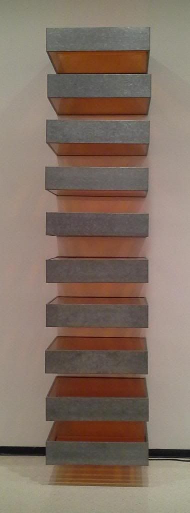
 On the left we have a piece by Donald Judd Untitled, 1969 made of Galvanized iron and Plexiglas. I truly enjoy the use of metal, light and symmetry. This just really looks great to me and I could see it as something I would have in my house. Clean lines, bright color and just clean looking, big fan! On the right we have a piece by Richard Anuszkiewicz Temple to Albers, 1984; Acrylic on canvas. Again showing my love for symmetry and clean lines. This piece was very disorienting when standing close to it and it made me feel like it was always moving. This distracted me and appealed to me. I still really liked the clean lines and the use of symmetry with that mix of movement to really complete the piece. The highly contrasting colors really made the movement happen when up close.

 The top image is of Robert Irwin's NIAGARA, 2012 which is comprised of rows of florescent lights that are tinted and colored. I would really what to know more of the concept on this piece. It is quite long and honestly I could not get a feel for what it was intended to portray. This is really what I would want to know. The lower image is a Kelly Richardson Installation view of Mariner 9, 2012. This is an exhibition on the upper floor that uses Three-channel high-definition video with 5.1 audio. I really like the concept of this piece and would love to hear her inspiration to come up with this idea as well as the technology used to incorporate the moving images. The robot in the left panel was what kept drawing my attention, but the whole scene was really cool.
I was asked to go to the gallery and take a look around, absorb the work and reflect on the pieces. While doing all this I had to focus on three questions:
- Which artworks made an impact or impression on me? Why?
- Which artworks do I feel a connection with? Why?
- Which artworks would I like to know more about? Why?
Now for the questions:
Which artworks made an impact or impression on me? Why?
The left piece is a Robert Irwin labeled as Untitled from 1967. It is a floating aluminum disc that is painted in lacquer that is protruding from the wall to cause the shadow rings you see behind the piece. I really like the optical effect this piece has from the spot lights that shine on the piece and the simplicity of it combined with the planning is really what appealed to me. On the right we have a piece by Tauba Auerbach also labeled Untitled (Fold) from 2012. When I first saw this I was sure the canvas was worked with a chemical or something to cause the creases but when I got up close, and I am talking close, there was no such creases on the actual canvas. Not one, I even looked at the profile to see if I could get any glimpse of one and it was all just from the acrylic. Really wowed me, and thus made an impression on me on how well an artist can make you see what they intended with the use of only paint.
Which artworks do I feel a connection with? Why?

Which artworks would I like to know more about? Why?
Saturday, March 2, 2013
Module 5 - Project #2 - Logos
This week I set out to create a logo using some background on the subject out of our textbook and a few online resources. I actually picked a logo of an app I use on my Samsung Galaxy Note tablet. This application is great and always getting better but the logo is lacking. The app is Lecture Notes and has been developing great so I figured why not take a crack at making it better. These are the current logos:


Subscribe to:
Comments (Atom)