I was asked to go to the gallery and take a look around, absorb the work and reflect on the pieces. While doing all this I had to focus on three questions:
- Which artworks made an impact or impression on me? Why?
- Which artworks do I feel a connection with? Why?
- Which artworks would I like to know more about? Why?
Now for the questions:
Which artworks made an impact or impression on me? Why?
The left piece is a Robert Irwin labeled as Untitled from 1967. It is a floating aluminum disc that is painted in lacquer that is protruding from the wall to cause the shadow rings you see behind the piece. I really like the optical effect this piece has from the spot lights that shine on the piece and the simplicity of it combined with the planning is really what appealed to me. On the right we have a piece by Tauba Auerbach also labeled Untitled (Fold) from 2012. When I first saw this I was sure the canvas was worked with a chemical or something to cause the creases but when I got up close, and I am talking close, there was no such creases on the actual canvas. Not one, I even looked at the profile to see if I could get any glimpse of one and it was all just from the acrylic. Really wowed me, and thus made an impression on me on how well an artist can make you see what they intended with the use of only paint.
Which artworks do I feel a connection with? Why?
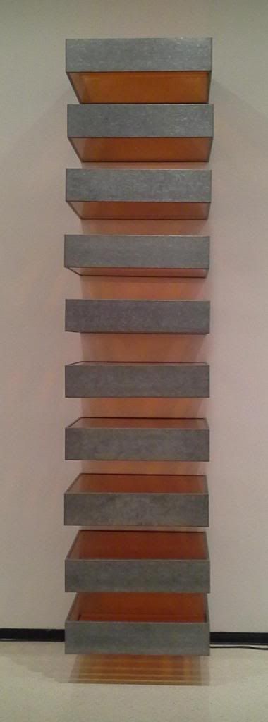
On the left we have a piece by Donald Judd Untitled, 1969 made of Galvanized iron and Plexiglas. I truly enjoy the use of metal, light and symmetry. This just really looks great to me and I could see it as something I would have in my house. Clean lines, bright color and just clean looking, big fan! On the right we have a piece by Richard Anuszkiewicz Temple to Albers, 1984; Acrylic on canvas. Again showing my love for symmetry and clean lines. This piece was very disorienting when standing close to it and it made me feel like it was always moving. This distracted me and appealed to me. I still really liked the clean lines and the use of symmetry with that mix of movement to really complete the piece. The highly contrasting colors really made the movement happen when up close.Which artworks would I like to know more about? Why?
The top image is of Robert Irwin's NIAGARA, 2012 which is comprised of rows of florescent lights that are tinted and colored. I would really what to know more of the concept on this piece. It is quite long and honestly I could not get a feel for what it was intended to portray. This is really what I would want to know. The lower image is a Kelly Richardson Installation view of Mariner 9, 2012. This is an exhibition on the upper floor that uses Three-channel high-definition video with 5.1 audio. I really like the concept of this piece and would love to hear her inspiration to come up with this idea as well as the technology used to incorporate the moving images. The robot in the left panel was what kept drawing my attention, but the whole scene was really cool.


It looks like you were drawn to more structural works of art during your visit to the Knox. All of the items that you selected to review had three dimensional aspects to them. I think that although these are very eye catching they do not appeal to me in the same way that they do to you.
ReplyDeleteI think that the one piece that I did enjoy was the Untitled from 1967. This is a very inventive piece that leverages shadow to incorporate into the design. I know that shadow is important in drawings and paintings but most people do not think of this when they are considering sculptures or instalments.
I am surprised to see that you used two of the same images for your project as I did. I had also said that Tauba Auerbach's "Untitled (Fold)" had an impression on me. I was amazed with the way it looked like it was actually raised off the wall, but when you looked close it really wasn't. I also used Richard Anuszkiewicz's piece, "Temple to Albers" for my project. I found the piece interesting and would like to know more about it. I found a few of the other images you used interesting while I was at the gallery, but only needing six images for this project, I did not use them. I didn't expect someone else to be interested in the same pieces as I was and for some of the same reasons.
ReplyDelete