This week our focus is on sculptures, installations and crafts. How these integrate into artwork is the question we pose. Our text book, Living With Art 9th Ed. by Mark Getlein and the following videos where used to review the topics:
For each of these videos lets try to lay out the key concepts of the art form. Also touch on the relationship of the text to the videos. Lastly the opinion of the films and how they added to the knowledge to the topics.
Through the Eyes of a Sculpture really showed how much time and preparation is needed to plan a piece. The care in conception, then modeling all the way to picking out the stone are carefully selected and highly individualized. I think the key facts where how many people really are involved in making a sculpture, and noting that it is rarely only one. The text showed some more detail with regards to the types of sculpting and the mediums used. This video was focused on the final product of marble. The beginning steps are similar with marble as bronze with respect to casting and creating forms or molds to head towards the final product. I thought the video was very informative and offered much in detail with regards to the sculptures care in planing the project and genuine love for what they do. It really breaks the notion of a single artist doing one piece and moving to the next and opens your eyes to the team effort used in creating a true masterpiece.
Installation Art really made an effort to explain the concept. What was interesting was how each artist defined the term. The general consensus seems to be a piece of art that becomes one with the area of installation while allowing the viewer to experience and interact with it. This leaves the options virtually endless and I think the video covers that very well. The text had very little on the topic by comparison to the sculpting and craft sides of art but the concept was explained very well. The video focused on the many forms of installation art and explained some of the controversy of the form, like a toilet that is sitting on a shelf, a bike wheel or even a unmade bed with cluttered night stand. The variation really show a new level of creativity and offer up a new conceptual form of art that offers a more immersible form of interpretation. Being surrounded by a piece and having it distort your senses really forces you to take each part of the work in which like all other forms of art offer a dynamic range of interpretation.
The Glass and Ceramics video really showed how an artist uses the material to form a piece suitable to its application. This video focused more on the diversity of glass and ceramic uses than the art side of its application. It did show how the range of applications and uses are thought out and planned to not only use the material correctly but also to offer up a positive visual experience. Our text was well balanced as well and showed the history of the mediums while focusing on the reasoning behind many of the uses. Glass has been used for years to showcase religious and other spiritual events, and ceramic has been used the same. These materials also found their ways into more everyday life. Any where you look that there is a standing building you are likely to see glass used to allow light in and also used to protect. The placement of these windows are carefully thought out in nearly every case and this adds to the visual acceptance of the material. Look in any cupboard and you will find glass or ceramic dishware. These can range from durable to ornate and really can show he multitude of purposes these materials can be used in. I liked how the video opened with how the two materials differ and then went into the uses with regards to art and everyday life. You will feel like these two materials are more entwined into your life then ever after watching it.
Friday, March 8, 2013

Sunday, March 3, 2013
Albright Knox Art Gallery Visit
One of the perks of going to a College that is right across the street from an art gallery is the cost of admission! As a student you get a discounted price and if you took advantage of it, Buffalo State offered a semester long pass for only $6! This worked in my favor for this little trip.
I was asked to go to the gallery and take a look around, absorb the work and reflect on the pieces. While doing all this I had to focus on three questions:


The left piece is a Robert Irwin labeled as Untitled from 1967. It is a floating aluminum disc that is painted in lacquer that is protruding from the wall to cause the shadow rings you see behind the piece. I really like the optical effect this piece has from the spot lights that shine on the piece and the simplicity of it combined with the planning is really what appealed to me. On the right we have a piece by Tauba Auerbach also labeled Untitled (Fold) from 2012. When I first saw this I was sure the canvas was worked with a chemical or something to cause the creases but when I got up close, and I am talking close, there was no such creases on the actual canvas. Not one, I even looked at the profile to see if I could get any glimpse of one and it was all just from the acrylic. Really wowed me, and thus made an impression on me on how well an artist can make you see what they intended with the use of only paint.
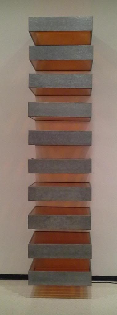
 On the left we have a piece by Donald Judd Untitled, 1969 made of Galvanized iron and Plexiglas. I truly enjoy the use of metal, light and symmetry. This just really looks great to me and I could see it as something I would have in my house. Clean lines, bright color and just clean looking, big fan! On the right we have a piece by Richard Anuszkiewicz Temple to Albers, 1984; Acrylic on canvas. Again showing my love for symmetry and clean lines. This piece was very disorienting when standing close to it and it made me feel like it was always moving. This distracted me and appealed to me. I still really liked the clean lines and the use of symmetry with that mix of movement to really complete the piece. The highly contrasting colors really made the movement happen when up close.

 The top image is of Robert Irwin's NIAGARA, 2012 which is comprised of rows of florescent lights that are tinted and colored. I would really what to know more of the concept on this piece. It is quite long and honestly I could not get a feel for what it was intended to portray. This is really what I would want to know. The lower image is a Kelly Richardson Installation view of Mariner 9, 2012. This is an exhibition on the upper floor that uses Three-channel high-definition video with 5.1 audio. I really like the concept of this piece and would love to hear her inspiration to come up with this idea as well as the technology used to incorporate the moving images. The robot in the left panel was what kept drawing my attention, but the whole scene was really cool.
I was asked to go to the gallery and take a look around, absorb the work and reflect on the pieces. While doing all this I had to focus on three questions:
- Which artworks made an impact or impression on me? Why?
- Which artworks do I feel a connection with? Why?
- Which artworks would I like to know more about? Why?
Now for the questions:
Which artworks made an impact or impression on me? Why?
The left piece is a Robert Irwin labeled as Untitled from 1967. It is a floating aluminum disc that is painted in lacquer that is protruding from the wall to cause the shadow rings you see behind the piece. I really like the optical effect this piece has from the spot lights that shine on the piece and the simplicity of it combined with the planning is really what appealed to me. On the right we have a piece by Tauba Auerbach also labeled Untitled (Fold) from 2012. When I first saw this I was sure the canvas was worked with a chemical or something to cause the creases but when I got up close, and I am talking close, there was no such creases on the actual canvas. Not one, I even looked at the profile to see if I could get any glimpse of one and it was all just from the acrylic. Really wowed me, and thus made an impression on me on how well an artist can make you see what they intended with the use of only paint.
Which artworks do I feel a connection with? Why?

Which artworks would I like to know more about? Why?
Saturday, March 2, 2013
Module 5 - Project #2 - Logos
This week I set out to create a logo using some background on the subject out of our textbook and a few online resources. I actually picked a logo of an app I use on my Samsung Galaxy Note tablet. This application is great and always getting better but the logo is lacking. The app is Lecture Notes and has been developing great so I figured why not take a crack at making it better. These are the current logos:


Friday, February 22, 2013
Using Acrylic Paint and Charcoal
This week I had the oppertunity to dabble a bit in the subtractive properties of acrylic paint and make a value scale with charcoal. It has been some time since I have used either medium but here is how they came out: |
| My 1st, 2nd and 3rd Attempt |
The actual process of making the two pieces was a little nostalgic. It brought me back to the art club I was in while in middle school and high school. It has been a long time since I painted something other than a house wall too!
 |
| Final Outcome |

Color Theory 2: Paint/Pigment Primary Colors, The Truth!!!
 |
| 10 Step Value Scale |
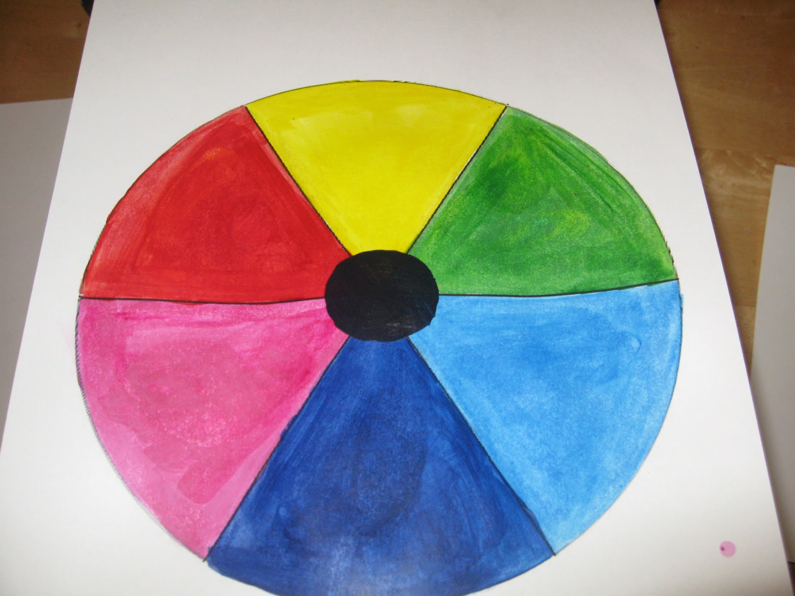
This video was crazy to me. Suggesting Red, Yellow and Blue are not the primary colors! WHAT! I had to watch it twice and sure enough the proof was in the pudding as it where. That was the mind blower of it all, that red, yellow and blue are not able to mix a black but magenta, yellow and cyan can! Which makes Red, Blue and Green secondary colors! I felt like I was lied to all through school. Yellow Magenta and Cyan are the 3 colors you see in most printer cartridges so I see the truth behind it but actually having to perform it was a shock. So much for Orange, Purple and Green as secondary colors!
Sunday, February 17, 2013
This week I was given the task to capture the different Elements and Principles of Design. Admittedly I was starting to over think this and try to capture some "Spike Lee" type images that would blow people away! Lets just say that became a lost cause with my Canon Powershot and I had to take it down a notch. For those who do not know here are the Elements and Principles that I set out to capture:
These are the images:
Now for each one of these I tried to capture the essence of the design quality. It will be hard to follow with the slides above because they do not go in the order I was hoping. But following along from the layout I listed above here is how I worked out each one of the elements and principles.
Line was easy to be honest, I looked for a while to find something interesting but this ended up being the one I liked most. The lines repeat and slowly compress closer together and all stop along a subtle curve that holds them all down.
Shape without saying is in nearly every photo I have but this picture really emphasis the actual shapes. The 2 circles and rectangle are easily picked out.
Forms here I wanted to show something that really would give the feeling of 3 dimensions. I took the picture to give the view of 3 side of the piece and really show the shadows of all the nooks in the wooden frame.
Space took me some time to commit to. I was not sure what I really wanted to showcase here but I ended up with a photo that committed to the negative space around the object. The open space forces you to focus on the black and crystal in the center of the frame.
Color was a quick sell for me. My wife picked up a plant that I have never seen before and it had a vibrant color and interesting direction of growth on the flower.
Texture took some experimenting. I tried to get my dogs involved and based on the photo your seeing, clearly the dog thing did not work out. Instead I made use of a pillow we have that really shows the short fur with the quick contrast of the flat black I added to make the picture have some extra quality.
Balance was another one I was not happy with when I went through all the photos I took. I had an idea of capturing an abstract scene with a clear balanced quality but in the end we get something a little more everyday. These 2 St. Patrick's Day bears balance the main focus of this picture. Though they are different they still have a similarity that almost makes you overlook the fact that they are different and because they are on either side of the glass you do not notice their differences at first.
Movement was one that I wanted to really work. This was another photo I took a lot of time making really complex and in the end the most simple solution really captured the principle. The single diagonal line forces you to look at the circle that it points to. You can not help but follow it at least once.
Emphasis came with the help of HGTV. A throw pillow on a chair really takes the focus off the chair and brings you eye to the pillow or accent. The little blip of orange is courtesy of my 10 month old and the little pop of color just added one more distraction that illustrated the emphasis a random color can add.
Pattern seemed to show up in alot of my pictures as well. I just really liked how the like behind this glass forced the pattern to almost distort from the center out.
Repetition was so close to pattern for me that my natural reaction was to stick with finding a "busy" pattern. These colored tiles have a clear pattern with 4 different colors that have yet another pattern within them. If you look closely you can see the repetition in the tiles and color but the center circles to not follow the same repetition.
Proportion only seems to work for me when it was even. I could not get the feel to translate to a picture unless the proportions were balanced. The candle fixture I ended up using shows and even proportion that flows left to right and top to bottom
Rhythm worked really well on this wall art piece. The circles with multicolored flowers incorporate well together and have a active pattern that moves through the piece.
Variety is what I see every time I pick up the kids toys. They all make their way into one bin or another and when I saw it in this bin variety is the first thing that jumped to my mind. The definition says that the elements are suppose to guide you through the work but I imagined it different.
Unity was my last big dream of really wowing someone with a cool picture. I just was not able to really capture the principle the way I wanted. These squares that show different sizes and colors all are complete in their own way and the way the surrounded each other gave me the closest feeling of unity I could accept.
Hopefully I was able to really show some good examples for everyone and I hope you were able to see my images as I saw them with relation to the Elements and Principles of Design.
Elements of Design
- Line is a mark with greater length than width. Lines can be horizontal, vertical or diagonal, straight or curved, thick or thin.
- Shape is a closed line. Shapes can be geometric, like squares and circles; or organic, like free formed shapes or natural shapes. Shapes are flat and can express length and width.
- Forms are three-dimensional shapes, expressing length, width, and depth. Balls, cylinders, boxes and triangles are forms.
- Space is the area between and around objects. The space around objects is often called negative space; negative space has shape. Space can also refer to the feeling of depth. Real space is three-dimensional; in visual art when we can create the feeling or illusion of depth we call it space.
- Color is light reflected off objects. Color has three main characteristics: hue or its name (red, green, blue, etc.), value (how light or dark it is), and intensity (how bright or dull it is).
- Texture is the surface quality that can be seen and felt. Textures can be rough or smooth, soft or hard. Textures do not always feel the way they look; for example, a drawing of a porcupine may look prickly, but if you touch the drawing, the paper is still smooth.
Principles of Design
- Balance is the distribution of the visual weight of objects, colors, texture, and space. If the design was a scale these elements should be balanced to make a design feel stable. In symmetrical balance, the elements used on one side of the design are similar to those on the other side; in asymmetrical balance, the sides are different but still look balanced. In radial balance, the elements are arranged around a central point and may be similar.
- Emphasis is the part of the design that catches the viewer’s attention. Usually the artist will make one area stand out by contrasting it with other areas. The area will be different in size, color, texture, shape, etc.
- Movement is the path the viewer’s eye takes through the artwork, often to focal areas. Such movement can be directed along lines edges, shape and color within the artwork.
- Pattern is the repeating of an object or symbol all over the artwork.
- Repetition works with pattern to make the artwork seem active. The repetition of elements of design creates unity within the artwork.
- Proportion is the feeling of unity created when all parts (sizes, amounts, or number) relate well with each other. When drawing the human figure, proportion can refer to the size of the head compared to the rest of the body.
- Rhythm is created when one or more elements of design are used repeatedly to create a feeling of organized movement. Variety is essential to keep rhythm exciting and active, and moving the viewer around the artwork. Rhythm creates a mood like music or dancing.
- Variety is the use of several elements of design to hold the viewer’s attention and to guide the viewer’s eye through the artwork.
- Unity is the feeling of harmony between all parts of the artwork creating a sense of completeness.
These are the images:
Now for each one of these I tried to capture the essence of the design quality. It will be hard to follow with the slides above because they do not go in the order I was hoping. But following along from the layout I listed above here is how I worked out each one of the elements and principles.
Line was easy to be honest, I looked for a while to find something interesting but this ended up being the one I liked most. The lines repeat and slowly compress closer together and all stop along a subtle curve that holds them all down.
Shape without saying is in nearly every photo I have but this picture really emphasis the actual shapes. The 2 circles and rectangle are easily picked out.
Forms here I wanted to show something that really would give the feeling of 3 dimensions. I took the picture to give the view of 3 side of the piece and really show the shadows of all the nooks in the wooden frame.
Space took me some time to commit to. I was not sure what I really wanted to showcase here but I ended up with a photo that committed to the negative space around the object. The open space forces you to focus on the black and crystal in the center of the frame.
Color was a quick sell for me. My wife picked up a plant that I have never seen before and it had a vibrant color and interesting direction of growth on the flower.
Texture took some experimenting. I tried to get my dogs involved and based on the photo your seeing, clearly the dog thing did not work out. Instead I made use of a pillow we have that really shows the short fur with the quick contrast of the flat black I added to make the picture have some extra quality.
Balance was another one I was not happy with when I went through all the photos I took. I had an idea of capturing an abstract scene with a clear balanced quality but in the end we get something a little more everyday. These 2 St. Patrick's Day bears balance the main focus of this picture. Though they are different they still have a similarity that almost makes you overlook the fact that they are different and because they are on either side of the glass you do not notice their differences at first.
Movement was one that I wanted to really work. This was another photo I took a lot of time making really complex and in the end the most simple solution really captured the principle. The single diagonal line forces you to look at the circle that it points to. You can not help but follow it at least once.
Emphasis came with the help of HGTV. A throw pillow on a chair really takes the focus off the chair and brings you eye to the pillow or accent. The little blip of orange is courtesy of my 10 month old and the little pop of color just added one more distraction that illustrated the emphasis a random color can add.
Pattern seemed to show up in alot of my pictures as well. I just really liked how the like behind this glass forced the pattern to almost distort from the center out.
Repetition was so close to pattern for me that my natural reaction was to stick with finding a "busy" pattern. These colored tiles have a clear pattern with 4 different colors that have yet another pattern within them. If you look closely you can see the repetition in the tiles and color but the center circles to not follow the same repetition.
Proportion only seems to work for me when it was even. I could not get the feel to translate to a picture unless the proportions were balanced. The candle fixture I ended up using shows and even proportion that flows left to right and top to bottom
Rhythm worked really well on this wall art piece. The circles with multicolored flowers incorporate well together and have a active pattern that moves through the piece.
Variety is what I see every time I pick up the kids toys. They all make their way into one bin or another and when I saw it in this bin variety is the first thing that jumped to my mind. The definition says that the elements are suppose to guide you through the work but I imagined it different.
Unity was my last big dream of really wowing someone with a cool picture. I just was not able to really capture the principle the way I wanted. These squares that show different sizes and colors all are complete in their own way and the way the surrounded each other gave me the closest feeling of unity I could accept.
Hopefully I was able to really show some good examples for everyone and I hope you were able to see my images as I saw them with relation to the Elements and Principles of Design.
Saturday, February 16, 2013
Color and its Effects on Emotion
Color has been used in art to manipulate our feelings and push forth an emotional response from works of art for centuries. Whether we are speaking of the old cave paintings of our ancestor or the beautiful works of art that line famous buildings though out the world. Our assignment this week was to explore this phenomenon of color and its effects on how a painting is perceived and what emotions are almost implied. There are two videos that I observed and a website that really shows the way colors are mixed in both additive and subtractive qualities. The links for the videos and color tool are as follows:The Elements of Art site has some really neat visual aids for showing the user how color changes based on how it is mixed and contrasted. There are a plethora of tools on the side bar that can really show you the way mixing paints or pigments varies by comparison to light. You will at least gain some perspective from this site if you are not well versed in the art of color mixing.
Emotions tie into the color of art in so many ways. The intensity or saturation of a contrasting color can add a warm feeling to a painting but it also holds the ability to add a darkness to a piece. The color harmonies or color schemes used on pieces can give you a bold and aggressive feeling with the use of warm colors used in analogous pieces with a consistent yellow to yellow-orange to orange and touching on red. That same work redone on the opposite side of the color wheel would have a completely different emotional presence; you would no longer feel warm and bold at the very least.
I think what is most interesting on the theory of color is how there is actually more than one! This was unknown to me. I was under the impression that there was one law that explained the hows and the whys of all things color. Our text book says "Different theorists have constructed different color wheels, but the once shown here is fairly standard." (Getlein, Living With Art, pg.89) Honestly I thought the only variations where how many wedges you wished to include to show the colors mix into different hues.
In the Color video I was surprised on how many times the artist changed her mind on the color scheme. She had kept the general concept though out the pieces conception but her idea of cool and warm colors was really personal to her. I thought her final work was a little dark for the actual scene that she was painting. I had to go back 2 times to see her work in the original site to get a feel for the colors she was trying to incorporate. Her emotional tie to the work displayed in the church and her need to keep those colors integrated I think really forced her to rework that painting so many times because she was not getting the emotional connection herself. If I were to not know what her color inspiration was, I would have guessed she saw this scene at dusk when the sun was very low and she wanted capture that moment.
The Feelings video developed more around the history of the times of art and how the pieces of their time used color to emphasis the emotion of the scene. They showed us how the pre Renaissance era used bright colors and life like paintings to show the growth of knowledge. Moving into the Enlightenment era when these same principles where used to depict the righteousness of God. The use of color here was shown on two sides. Where you saw brightly colored handsome people you were assured of nobility or perceived a divine quality. On the other side where the colors were dark and kept to the earth tones we could feel the lower class being portrayed and the sinners being judged. The use of color to divide good and evil was as common theme and even the use of bright detail and hazy dark backgrounds where used to show and emanate the feeling of depth.
Tuesday, February 5, 2013
Aesthetics and Art
I had a chance to watch a few videos and an article on the aesthetics of art and came away with quite a few interesting views. I would say the largest impact would be with regards to the angle in which these philosophers and scientists approach the meaning of art.
Here are links to the 2 videos I had the pleasure of watching:
This is the article:
Now be prepared the 2 videos are about an hour each so do not dive in unless you have some time, but rest assured you will come out with some interesting ideas on the idea of aesthetics.
I particularly like the progression of how art is perceived and interpreted as it follows the line of history. Plato of 4th Century BC philosophy had a view that everything we make and create is nothing more than our interpretation on the perfect idea of what we are trying to convey. He believed that art is nothing more than a distortion of some things true form and thus a fake. His strict views on how objects only exist in their current form as a representation of our idea of perfection really holds true to deep philosophical thinking. I also like the portrayal that Morris Weitz gives from the 20th Century. His thoughts are that, due to the ever changing aspects of that logically you are unable to set a formal property on its definition. Due to art developing as the world around us develops and changes and as our tastes evolve and twist there is no way to predict what the future may bring us. If you cannot see the future then you cannot develop a set of rules that define art, logically thinking. I think his use of logic to defend his case is what really makes it interesting for me. Combining the simple rules of logic to basically cast away the need to define art and focus on the what art represents and the roles it plays in our lives.
The science angle taken here is very interesting. To approach this topic from a non divine science approach and try to tie specific natural scientific proof to what a human perceives as art almost feel mechanical. To say the development of the size of our brains naturally led us to be able to identify pleasing objects and then to create them seems natural but the question as to why seems to elude everyone. I do not personally think they will be able to set a rule or a set of rules that will define all art. They may be able to measure the brain activity of the whole human race and still fall short in their theory the next decade. The ideas behind their work is viable and both sets of rules have the same open ended-ness to be used as an outline for their definition. Changeux biological approach on the whole is interesting to me. I think that even though we may be able to map a path of a brain pattern that we are still missing more connections that are not being measured. With studies you may be able to show how a brain reacts when any number of situations occur but then you have to account for the occasions when your theory fails thus losing some weight on a scientific base. If gravity suddenly did not work in one random area and we could not explain the anomaly we would have to revisit that scientific model as well. Ramachandran touched on a point that I like with regard to the complexity of the optic path way. His take on the complexity of the 30 plus inputs the eye perceives offers a great way to see how many paths and different takes people can have on the same art piece.
This piece is has clean lines and the color pop that is optically mind blowing. The fact that it is a free standing unit and not a painting is what I like the most about it. They fact that every angle has a different perspective and that to me is a well developed piece of art made my a neuroscience professor, not a typical artist.
Now this blog is centralized around a class I am taking at Buffalo State College and our course text covers some ideas that are touched on in the above mentioned pieces. I would say the best relation our text has to the pieces we covered here are with regards to the many layers of what makes art. Culture, life experiences and exposure all pay a role on how art is made as well as perceived. Even the touch on the normal every day items that transform into art, Soup cans and cereal boxes and the likes.
After reviewing the films and reading through the article and our textbook I have been exposed to a much more scientific view of aesthetics. For me art has always been a personal connection that would be both easy to discribe and yet hard to explain. A physiologist could probably analyze my views and attribute it to something in my past but I still think that would only lead to the tip of the iceburg. I enjoyed the insight and especially the overview of aesthetics in art and hope the next time I see a piece of art that I can think more critically about why I find it intriguing or not.
Here are links to the 2 videos I had the pleasure of watching:
This is the article:
Now be prepared the 2 videos are about an hour each so do not dive in unless you have some time, but rest assured you will come out with some interesting ideas on the idea of aesthetics.
Lets hop into the videos and see what we learn!
Aesthetics: Philosophy of the Arts
In our first video we are given the conceptual background of aesthetics. This philosophical definition of art and why we humans are drawn to it. The narration starts us off with the thoughts of a well known philosopher, Plato. Now his views on art are not the typical forms of beauty and expression but he sees them in a very different light and this debate brings forth our topic, aesthetics. The video is laid out nicely, however the resolution we have access to is of low quality unfortunately. They progress nicely through the century marks and take care to note prominent philosophers views in this category. What we take away is the debate that still exists today. What is it about art that makes us fall in love with it, and what secret recipe is needed to ensure a piece is art?I particularly like the progression of how art is perceived and interpreted as it follows the line of history. Plato of 4th Century BC philosophy had a view that everything we make and create is nothing more than our interpretation on the perfect idea of what we are trying to convey. He believed that art is nothing more than a distortion of some things true form and thus a fake. His strict views on how objects only exist in their current form as a representation of our idea of perfection really holds true to deep philosophical thinking. I also like the portrayal that Morris Weitz gives from the 20th Century. His thoughts are that, due to the ever changing aspects of that logically you are unable to set a formal property on its definition. Due to art developing as the world around us develops and changes and as our tastes evolve and twist there is no way to predict what the future may bring us. If you cannot see the future then you cannot develop a set of rules that define art, logically thinking. I think his use of logic to defend his case is what really makes it interesting for me. Combining the simple rules of logic to basically cast away the need to define art and focus on the what art represents and the roles it plays in our lives.
CARTA: Neurobiology, Neurology and Art - Aesthetics
Moving on to the scientific side of Aesthetics, we are exposed to two well developed lectures on aesthetics. Our first speaker, Changeux, has a theory to explain our natural development into visual arts. He is careful to point out that he is strictly basing his approach on visual arts. He lays out a set of general rules that would help classify what makes a piece art worthy and he goes into great lengths on the development of the size of the human brain and its connections to symmetry. Our second speaker, Ramachandran, dives into what he calls visual esthetics. He covers a few different aspects of visual distortion to captivate and draw in the art audience. He also covers his rule set that he lays out originally as the "8 Laws of Art" but he moves on later to say, "cross out art" and points out he is referring to esthetics in general.The science angle taken here is very interesting. To approach this topic from a non divine science approach and try to tie specific natural scientific proof to what a human perceives as art almost feel mechanical. To say the development of the size of our brains naturally led us to be able to identify pleasing objects and then to create them seems natural but the question as to why seems to elude everyone. I do not personally think they will be able to set a rule or a set of rules that will define all art. They may be able to measure the brain activity of the whole human race and still fall short in their theory the next decade. The ideas behind their work is viable and both sets of rules have the same open ended-ness to be used as an outline for their definition. Changeux biological approach on the whole is interesting to me. I think that even though we may be able to map a path of a brain pattern that we are still missing more connections that are not being measured. With studies you may be able to show how a brain reacts when any number of situations occur but then you have to account for the occasions when your theory fails thus losing some weight on a scientific base. If gravity suddenly did not work in one random area and we could not explain the anomaly we would have to revisit that scientific model as well. Ramachandran touched on a point that I like with regard to the complexity of the optic path way. His take on the complexity of the 30 plus inputs the eye perceives offers a great way to see how many paths and different takes people can have on the same art piece.
What the brain draws from: Art and Neuroscience
Here we explore the neuroscience behind art again. This article depicts the use of optical tricks to grab a viewers attention and provoke thought. The elements covered are a very good starting point in understanding the concepts behind great pieces of art and the illusions they present. I am particually fond of this piece by professor Semir Zeki: |
| Squaring the Circle |
Now this blog is centralized around a class I am taking at Buffalo State College and our course text covers some ideas that are touched on in the above mentioned pieces. I would say the best relation our text has to the pieces we covered here are with regards to the many layers of what makes art. Culture, life experiences and exposure all pay a role on how art is made as well as perceived. Even the touch on the normal every day items that transform into art, Soup cans and cereal boxes and the likes.
After reviewing the films and reading through the article and our textbook I have been exposed to a much more scientific view of aesthetics. For me art has always been a personal connection that would be both easy to discribe and yet hard to explain. A physiologist could probably analyze my views and attribute it to something in my past but I still think that would only lead to the tip of the iceburg. I enjoyed the insight and especially the overview of aesthetics in art and hope the next time I see a piece of art that I can think more critically about why I find it intriguing or not.
Subscribe to:
Posts (Atom)